BREAKING:
Breaking news article thingies found sliding the wrong direction
Depression has returned, what now?
Oh fuck the posters are lop sided fuck
Study shows proper cable management to cure depression
New posters hung up in room, eternal happiness found for 3-5 business days
BREAKING:
Breaking news article thingies found sliding the wrong direction
Depression has returned, what now?
Oh fuck the posters are lop sided fuck
Study shows proper cable management to cure depression
New posters hung up in room, eternal happiness found for 3-5 business days
The new banknotes!
04/08/2026
tags: #english , #politics
04/08/2026
The ECB recently hosted a design contest for the next series of euro banknotes! Out of all the submitted designs, ten were picked to pass to the next phase. In this phase the public gives feedback on each through this survey and then the highest rated design will be adopted in a couple years!
The redesign is in part for making counterfits harder, but for me, as someone who believes europe should integrate more closely, I really like the idea of giving us a more shared identity and that starts with common experiences, like this survey!
Its the little everyday things that we don’t think about that often that bring us closer, so i’m gonna think about them. out loud. now.
I’ve always liked looking at different coins and banknotes from around the world, its so fun! I wouldn’t call myself a collector but I do indeed collect, and my favourite thing is when countries try to make their currency stand out or generally look cool, and I do like the current banknote designs but visually the Europa series really didn’t change much from the first series so a fresh design that isn’t just fake buildings is real nice!
Europe was always really scared of leaving anyone out in their designs but what they chose instead was to leave everyone out with designs that only match a vague idea of “european”.
Using local birds or influential figures from european culture instead I think fits better for showing off what we have to offer.
And also the back sides showing buildings of our european institutions is a good compromise because despite being mostly in Belgium and France they are institutions that are for all of us, i guess. Still not too fond of the idea solely because the buildings aren’t exactly... pretty.
Won’t complain too much as long as we keep having the €0 notes!
Anyways, now I’m gonna put all the designs and leave my review on each. (Thank you to EUMS on Inst*gram for the pictues)
DESIGN A

also why is €5 fucking grey.
DESIGN B

also why is €5 fucking grey.
DESIGN C
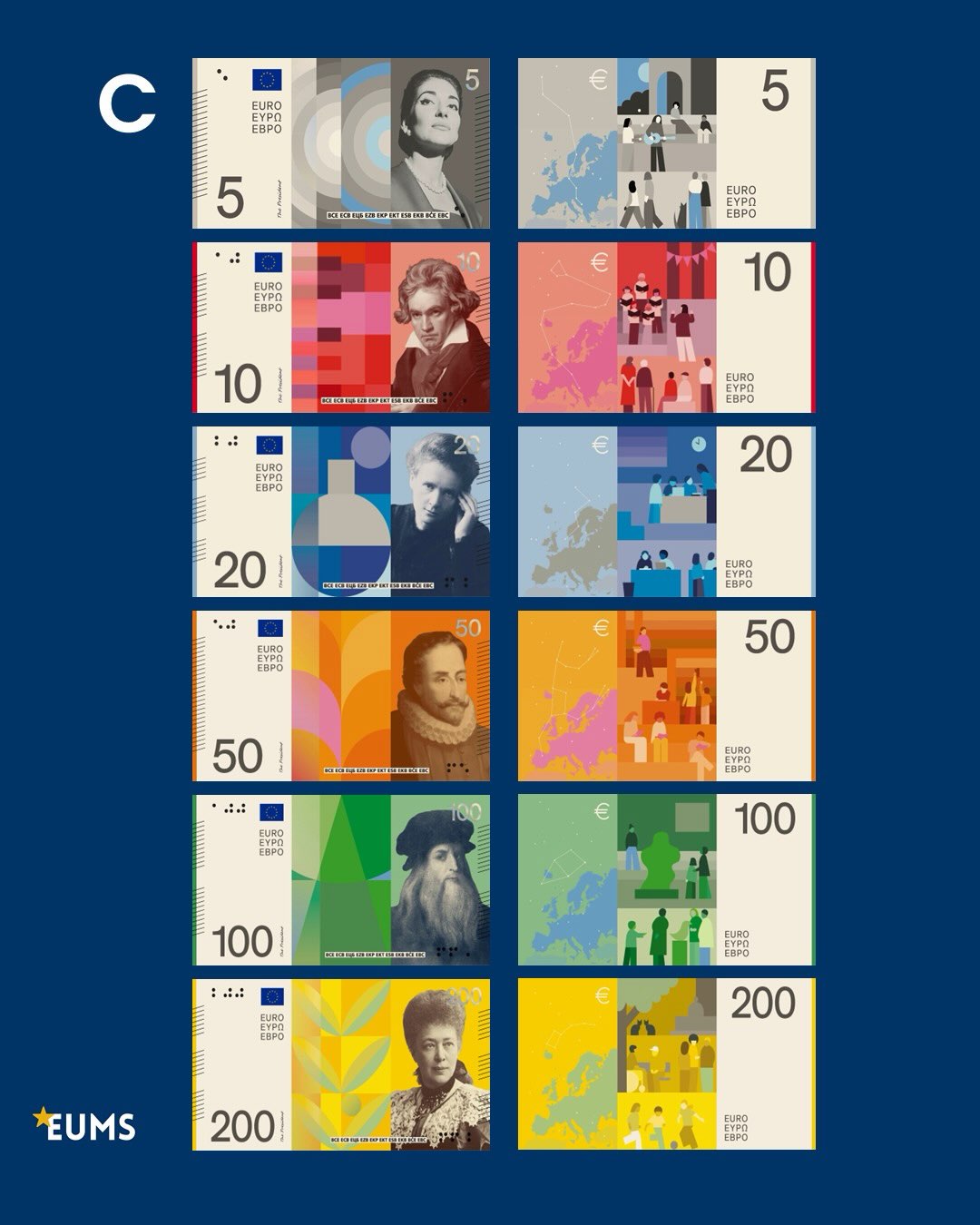
what does maria callas have to do with weird circles, what does beethoven have to do with weird rectangles, what does marie curie have to do with weird circles and weird rectangles, what does cervantes have to do with weird semicircles and trapezoids, what does da vinci have to do with weird triangles and trapezoids.
the €200 at least looks like plants or something but im not sure if Bertha von Suttner has anything to do with plants, thats just my ignorance though.
and no, no i do not want facebook allegria style on the back of my banknotes thank you very much.
also why is €5 fucking grey.
DESIGN D

also why is €5 fucking grey.
DESIGN E

I like the patterns behind the figures with a lot of details (the Bertha one again has plant motifs so im gonna assume she does indeed have something to do with plants) and the designs on the back mostly dont suffer from the corporate style that A and C suffer from, but the €5 and €50 get a bit too close.
also why is €5 fucking grey
DESIGN F
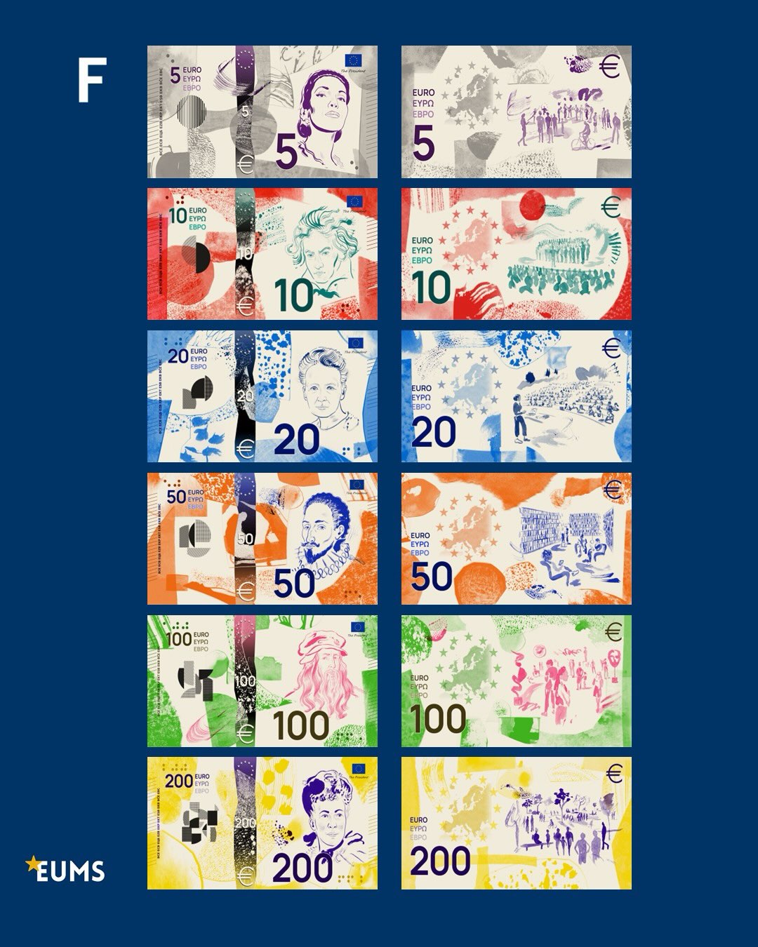
Really the designs are pretty ok but the colouring really makes it feel more like a doodle on a blank page than a banknote. I do like how the 12 stars and the european map are placed on the back designs though! Not really much else to say on this one honestly.
also why is €5 fucking ...purple??
DESIGN G

As stated previously i’m a sucker for the vertical, and allthough this one does have the same issue with mixing vertical and horizontal for the big and small numbers I don’t see it as such an issue because the small numbers on the front are pretty small and on the back they don’t really stand out as much so I’ll take it.
Overall this one manages to keep a modern vibe while still being vibrant and detailed, looks artsy not corporate. On the back I really like how the big number is given an actual section shared with the 12 stars and the map rather than just pasted on top of the design. Really like it.
also €5 keeps most of its green for once!
DESIGN H

That isn’t a bad thing but it means I don’t have much to say about it, neither negative nor positive. It keeps the positioning of the elements the same as the Europa series but changing the background to be birds and government buildings instead of fake monument and fake bridges.
and €5 keeps some of its green.
DESIGN I

its the first to be fully vertical and keeps a tasteful bit of that classic feeling from the first series while not looking outdated, especially the €50. The birds being centered and in their full colour over the pigmented backgrounds makes them stand out very nicely :)
Not much to say about the back designs other than the 12 starts are notably absent which makes me sad. I like how the buildings are framed but having those blank figures in front of them do give hints of that corporate style which, as may be clear by now, I don’t particularily enjoy. But its minimal and overall I feel very positively about this one.
...also why is €5 fucking grey.
DESIGN J

for me personally all this turns out to be too much but thats a me problem and im happy for their girlbossing selves.
also why is the €5 grey.
Sooo top 3 are G, I, and J ((not in order))
No hate intended for the artists behind this, this is all just my personal artistic preferences for banknotes i probably wont be seeing much if we keep going the direction we’re going. also let this not distract us from the repeated attempts to hijack our privacy with chat control or the dehumanising treatment that people seeking refuge receive from FRONTEX. fuck FRONTEX and all those who use human beings in search of a better life as weapons against their political rivals.
bye.
about me
hi, i'm krims!! i like to yap.
i'm a teenager from spain.
sooo basically what you need to know about me is that i never really played videoggames or went on the internet much as a child other than to watch this.by clicking the hyperlink you agree to youtube's wacky privacy policy that i like very much and is not at all concerning not because of strict parents but my mum taught me it was silly so i never really wanted to. for this reason all this stuff is generally new to me, but i really like it even if im not good at internet! in fact, i'm not really that good at anything. i don't mean that as a bad thing just as a kid i never really found the thing to dedicate time to so i never really developped any skills. thats my goal now, to get good at stuff. which is why im here. this is my first real attempt to learn "programming", i did have private C++ classes for a short time but i stopped bc i needed to focus on school.. either way i got bored quickly. i don't expect to interest anyone with what i have to say, i'm here to learn shit and documenting myself is the fun side effect! so here I'll write about things that interest me and stuff i guess. idk. bye. oh and my pronouns are they/them