tags: #english , #politics
The ECB recently hosted a design contest for the next series of euro banknotes! Out of all the submitted designs, ten were picked to pass to the next phase. In this phase the public gives feedback on each through this survey and then the highest rated design will be adopted in a couple years!
The redesign is in part for making counterfits harder, but for me, as someone who believes europe should integrate more closely, I really like the idea of giving us a more shared identity and that starts with common experiences, like this survey!
Its the little everyday things that we don’t think about that often that bring us closer, so i’m gonna think about them. out loud. now.
I’ve always liked looking at different coins and banknotes from around the world, its so fun! I wouldn’t call myself a collector but I do indeed collect, and my favourite thing is when countries try to make their currency stand out or generally look cool, and I do like the current banknote designs but visually the Europa series really didn’t change much from the first series so a fresh design that isn’t just fake buildings is real nice!
Europe was always really scared of leaving anyone out in their designs but what they chose instead was to leave everyone out with designs that only match a vague idea of “european”.
Using local birds or influential figures from european culture instead I think fits better for showing off what we have to offer.
And also the back sides showing buildings of our european institutions is a good compromise because despite being mostly in Belgium and France they are institutions that are for all of us, i guess. Still not too fond of the idea solely because the buildings aren’t exactly... pretty.
Won’t complain too much as long as we keep having the €0 notes!
Anyways, now I’m gonna put all the designs and leave my review on each. (Thank you to EUMS on Inst*gram for the pictues)
DESIGN A

also why is €5 fucking grey.
DESIGN B

also why is €5 fucking grey.
DESIGN C
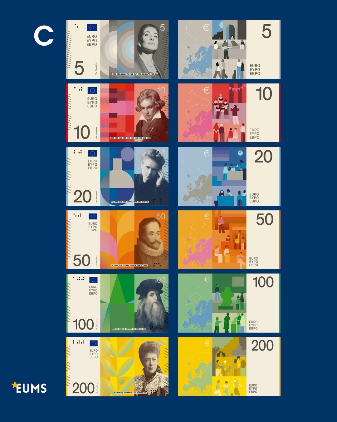
what does maria callas have to do with weird circles, what does beethoven have to do with weird rectangles, what does marie curie have to do with weird circles and weird rectangles, what does cervantes have to do with weird semicircles and trapezoids, what does da vinci have to do with weird triangles and trapezoids.
the €200 at least looks like plants or something but im not sure if Bertha von Suttner has anything to do with plants, thats just my ignorance though.
and no, no i do not want facebook allegria style on the back of my banknotes thank you very much.
also why is €5 fucking grey.
DESIGN D

also why is €5 fucking grey.
DESIGN E

I like the patterns behind the figures with a lot of details (the Bertha one again has plant motifs so im gonna assume she does indeed have something to do with plants) and the designs on the back mostly dont suffer from the corporate style that A and C suffer from, but the €5 and €50 get a bit too close.
also why is €5 fucking grey
DESIGN F
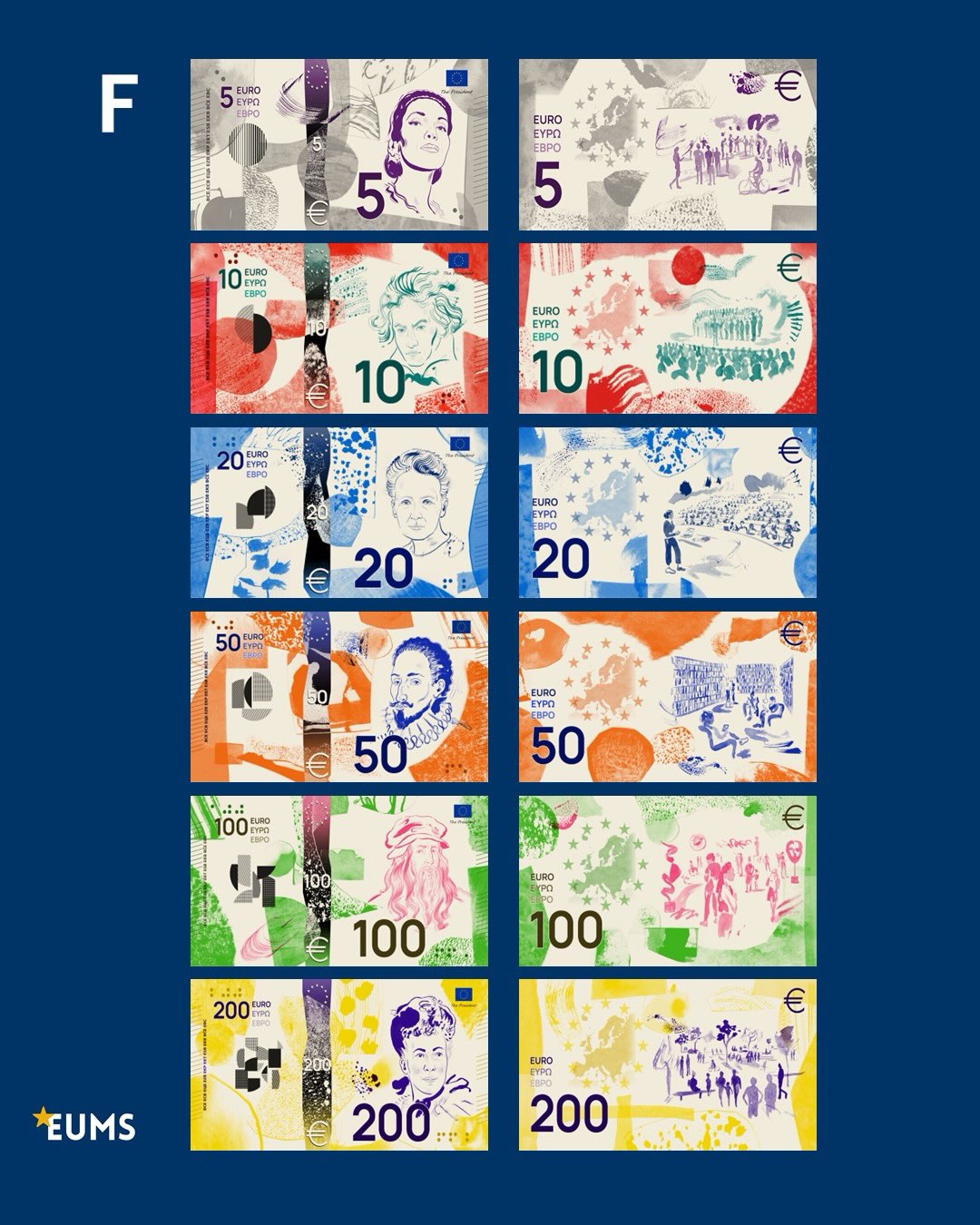
Really the designs are pretty ok but the colouring really makes it feel more like a doodle on a blank page than a banknote. I do like how the 12 stars and the european map are placed on the back designs though! Not really much else to say on this one honestly.
also why is €5 fucking ...purple??
DESIGN G

As stated previously i’m a sucker for the vertical, and allthough this one does have the same issue with mixing vertical and horizontal for the big and small numbers I don’t see it as such an issue because the small numbers on the front are pretty small and on the back they don’t really stand out as much so I’ll take it.
Overall this one manages to keep a modern vibe while still being vibrant and detailed, looks artsy not corporate. On the back I really like how the big number is given an actual section shared with the 12 stars and the map rather than just pasted on top of the design. Really like it.
also €5 keeps most of its green for once!
DESIGN H

That isn’t a bad thing but it means I don’t have much to say about it, neither negative nor positive. It keeps the positioning of the elements the same as the Europa series but changing the background to be birds and government buildings instead of fake monument and fake bridges.
and €5 keeps some of its green.
DESIGN I

its the first to be fully vertical and keeps a tasteful bit of that classic feeling from the first series while not looking outdated, especially the €50. The birds being centered and in their full colour over the pigmented backgrounds makes them stand out very nicely :)
Not much to say about the back designs other than the 12 starts are notably absent which makes me sad. I like how the buildings are framed but having those blank figures in front of them do give hints of that corporate style which, as may be clear by now, I don’t particularily enjoy. But its minimal and overall I feel very positively about this one.
...also why is €5 fucking grey.
DESIGN J

for me personally all this turns out to be too much but thats a me problem and im happy for their girlbossing selves.
also why is the €5 grey.
Sooo top 3 are G, I, and J ((not in order))
No hate intended for the artists behind this, this is all just my personal artistic preferences for banknotes i probably wont be seeing much if we keep going the direction we’re going. also let this not distract us from the repeated attempts to hijack our privacy with chat control or the dehumanising treatment that people seeking refuge receive from FRONTEX. fuck FRONTEX and all those who use human beings in search of a better life as weapons against their political rivals.
bye.
tags: #tag1 , #tag2
I don't know how to write a blog lol
Like I have ideas on specific posts to write like THE CHAPTER FIVE POST but I'm just not mentally ready for them yet :pp
So I guess I'll take this one to just talk about the sorta thing I want to write about, not that I have a concrete plan on them or anything. This also helps me clarify in my head what I want to do bc idrk XD
sooo I'm not really an insightful typa guy when it comes to most media but when I am i WILL rage about it and when i'm not i'll still talk about media that i like or talk about cool people that *have* shared insight on media i like. this comprises what i think the majority of posts on here will be like!
then i'd also do some more personal posts where I talk about things that have happened around me and how i interpret them or just lil thoughts I have. I want to differentiate this from a diary but not really sure how to. i guess a diary is more vulnerable in trying to document thoughts to make sense of them as its main purpose and that will also happen in writing this stuff? But I think the main purpose of this is more to get some thoughts from me out there, not for anyone to find them necessarily but just so they exist. i guess. again I really don't know I'm just ballin. huh maybe this is more introspective than I thought :p
I also wanna leave in writing more of what this site will have other than the posts. the blog was always the drive to make a website but while making it i've also realised i'd like to do other things too!
soo originally each "topic" was gonna have its own blog, so whenever i wanted to write a post about a certain thing i'd go to that blog. this was a cool idea because then each one could be themed around the topic its about. when it came to implementing it tho I realised it really didn't make much sense considering... myself. I feel like very rarely would I come up with a post that is decisively of one topic without heavily relying on drifting to others and mixing them. also it'd just be weird because it would intentionally limit what i could write about to how many "blogs" i had and most of them would feel empty for a pretty long while and even after that some would have a disproportionate amount of-
point is that idea didn't work out. that has since developed into two things:
the shrines, which as of now the minecraft one is the only one with a page and the current version was made with the intention of being a full blog rather than a shrine. i think shrines are cool, they're the first thing that got my attention while exploring on neocities and people have made some really cool ones! sometime i'd like to show a bunch that i like on here but i'm not sure what the etiquette of linking to people's sites is when you don't know them so i gotta figure that out first...
and the other thing is the tags. i want to have tags for each post that in the archive are searchable so you can filter by each which is kinda the original intention anyway. no idea how to implement this so i kinda maybe might've asked a clanker for ideas(sorry) and it suggested using a javascript thingy which i haven't played with yet sooo that'll be fun when i get round to working on the archive!!
The other thing that has been on the back of my mind since making this is how long a post should be. I don't want them to be too wordy but i really have not the slightest idea when its wordy so im just kinda going until i feel like ive ran out of coherent shit which (surprisingly) takes quite a while!
like on one hand there's a worry that people will get bored and hate me if i make a WALL OF TEXT but also this is more for myself than anyone so it shouldnt worry but I still don't like coming off as annoying in a public space even if nobody's there. (i still do tho)
like this is specifically my void to scream at and receive no answer but even then i wouldn't want to wake the dark matter, you know! or something.
also one of the things i like about this is the possibility of coming back to it in the future and reading and going "oh yeah i remember that!" and "oh fuck i really said that??" but i know the more i write the more opportunities future me will have to cringe and hate at me and i don't like being disliked by future me :(
oh also just let it be known that my main reference for posts is the spamton sweepstakes holidaygirl1225 blog so take of that what you may... i dont really tend to read blogs which is probs why idk how to write one
oh also idk if you can count it as a blog but etymology nerd's substack is very good highly recommend! specifically his post "a phone free future" is a very good read (bit preachy tho) and reminded me of when i was thinking of getting a dumbphone so might revisit that idea...
ok i'm running out of things to yap about what wouldn't spiral into a whole other post but maybe this has helped set the scene for me of what a post looks like... yay! idk how frequently i'll be posting during the summer break but i also wanna get some shrines and the archive done before it ends and maybe by then i'll have come up with some other ideas on thingies to put on the site like some minigames and stuff!
bye.